
.png)

I was tasked with creating a poster for a fictional psychology event using affinity photo. My design was inspired by the 1950s early technology ad. I wanted to bring back the sense of retroism and make and interesting and unique design for my poster.
Modern graphic design may look back on the 1950s and see all the designs as overcrowded and ineffective but what I loved About the designs is how they capture real people using their product. I also find 1950s design to just be something rather interesting as its some of the first modern ads .


The 1950s had very different rules for graphic design many of which are totally foreign for us toady. I wanted to break these modern rules I wanted to have paragraphs of text , too many different fonts and capture the idea of the 1950s, to create a eye catching and unique poster.


With the project we used affinity photo, this project was my fist affinity photo project. As such I had to learn a lot before I could begin this project.
This was a rather interesting experience , while affinity phots is rather straightforward, I like to push the boundaries as such many the ideas I wanted to add took longer than I had expected.
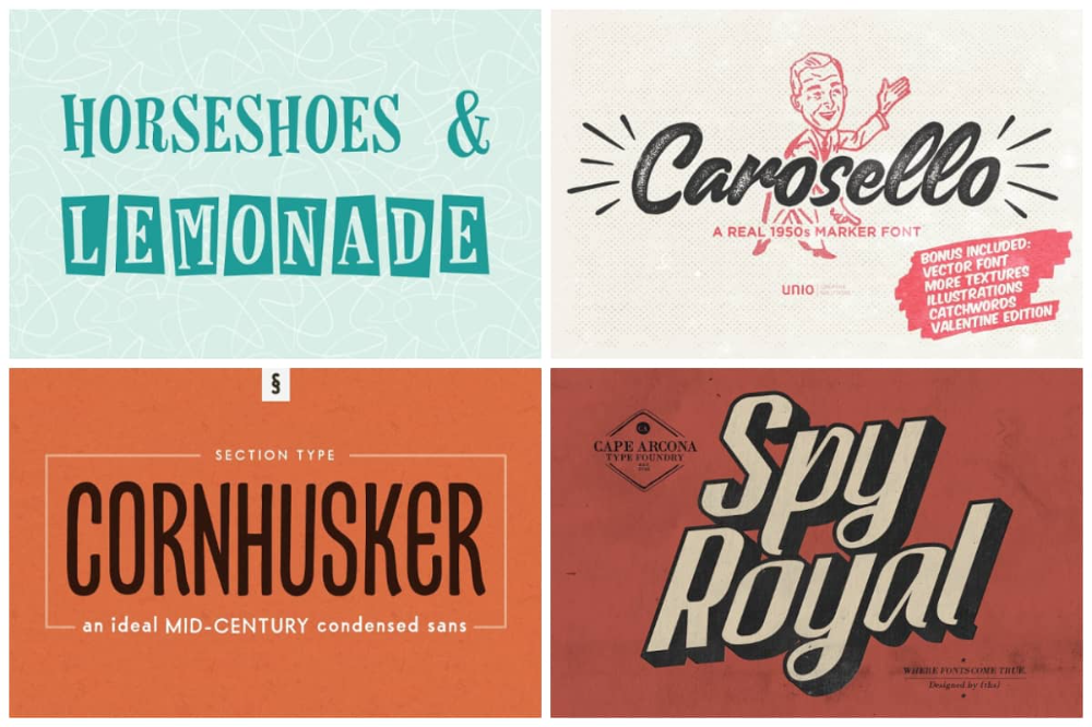
My main design inspersions is that of ads from the 1950/60s. I was inspired by many old ads that were published in newspapers at the time these ads were some of the first modern ads. To me they convey a different time and accurately capture what people where thinking of the time. Similarly I was also inspired by collages specifically newspaper collages.
Much like many of my project this poster went to many different design Iterations. From the beginning I was inspired by C82.net and I knew I wanted to do something about looking into the past but It was only after browsing Pinterest that I began to come across 1950s ads that I decided to commit to it .

If you look at any poster form the 1950s you will loads of different fonts. This is largely due to 1. the reduced number of different ads 2. the medium of the ads were largely in newspapers. They tended to use big paragraphs of text explaining the befits of their product . I wanted to emulate this in my poster .

1950s design is truly fascinating as mentioned it served as the main inspiration to my design. However if you look close there is much more in the rainbow each colour is inspired by a cut-outs of a different decade , comprising of over 70 items. In most of my design I used cut-outs from public domains works from the time trying to be authentic as possible . The swords falling from the cloud are meant to resent the real world away from dreams and surrealism.

As I making this website there are many change that I would make to this design.
Despite these changes I am still very proud of my work


Like many of project I learned lot doing this
This project was my introduction to Affinity phot and without it I don't think I would be half as capable as I am today.
Overall this project was quite fun to work with complete freedom of topic to design I focused on design fist poster. I really liked exploring old newspapers and magazines and explore the evolution of graphic design.